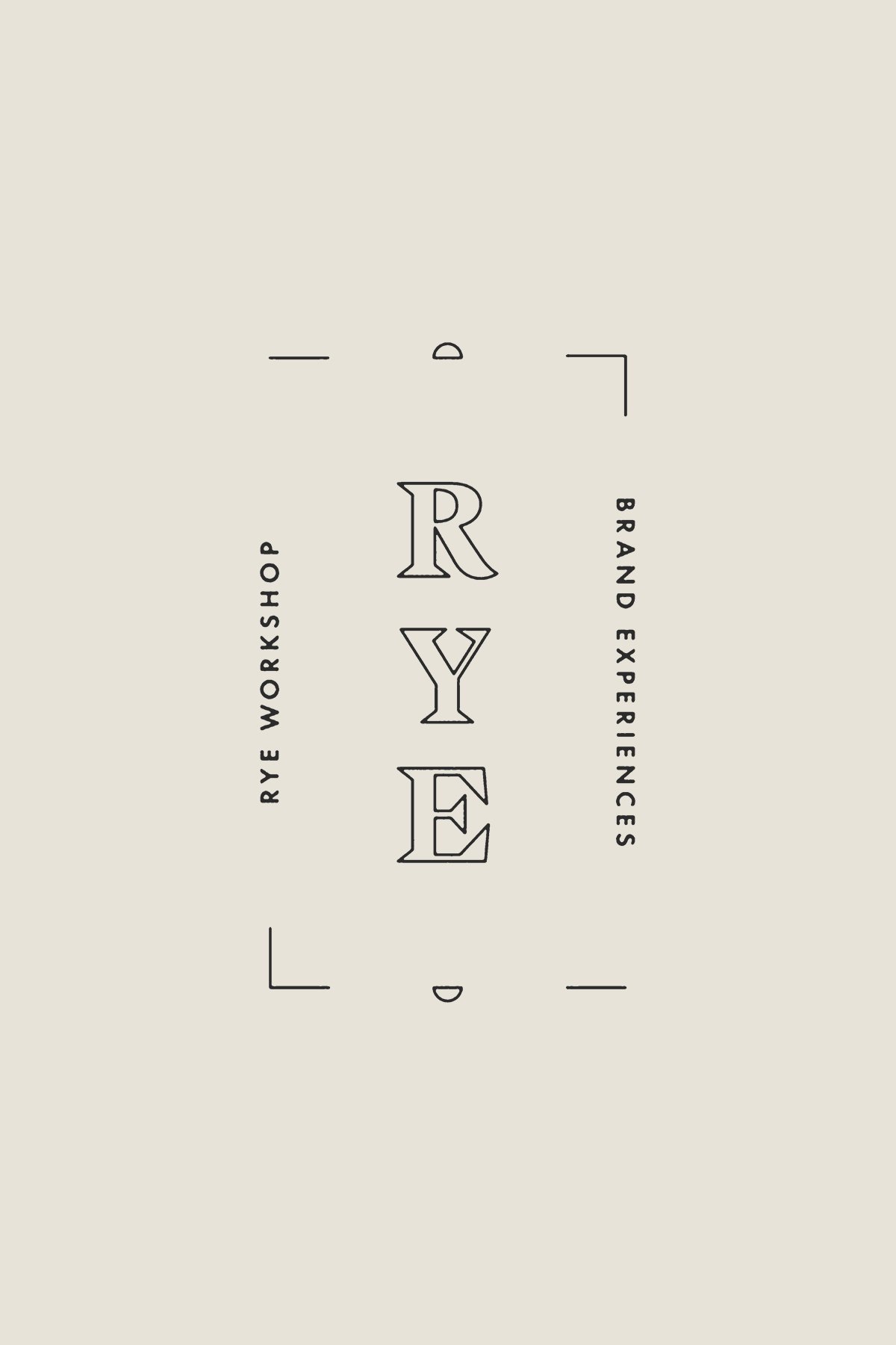
Logo Portfolio
Work samples of logos, monograms, and submark designs.


The Process
We love developing custom fonts and getting into the fine details of beautiful typography. Here’s a sample from developing a custom logomark for our client Goodwin and notes on the concepts and details of the customization.
BEFORE
As a starting point, we chose a font that had a mix of classic and modern aesthetic.
After
The primary logo wordmark was customized to have bespoke details. We added extended serifs in just the right places. The G, D, W, I, N have serifs that are asymmetrical on an individual level, only on the left side, yet all the letters are are cohesive along the top line. Along the baseline, we cut the letterforms to have tapered angles at the bends of the W and N, and the spur of the G. We created a custom crossed W letterform to make the branding feel more intricate and classic. To balance the D and N, and make the font appear tall rather than wide, we ensured the width of the G and O letters were condensed.