Goodwin
Fashion, RETAIL
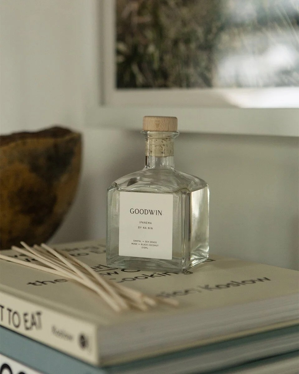
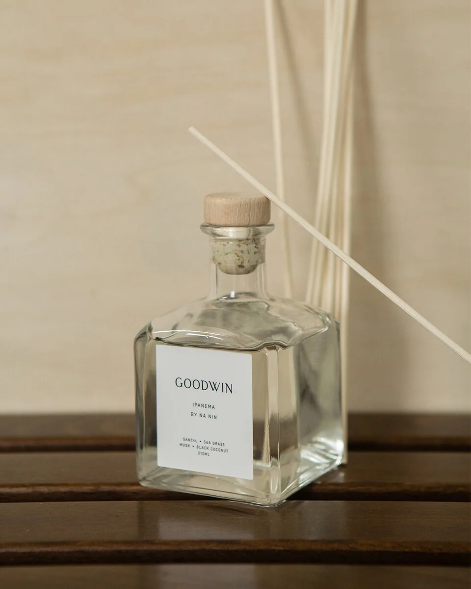
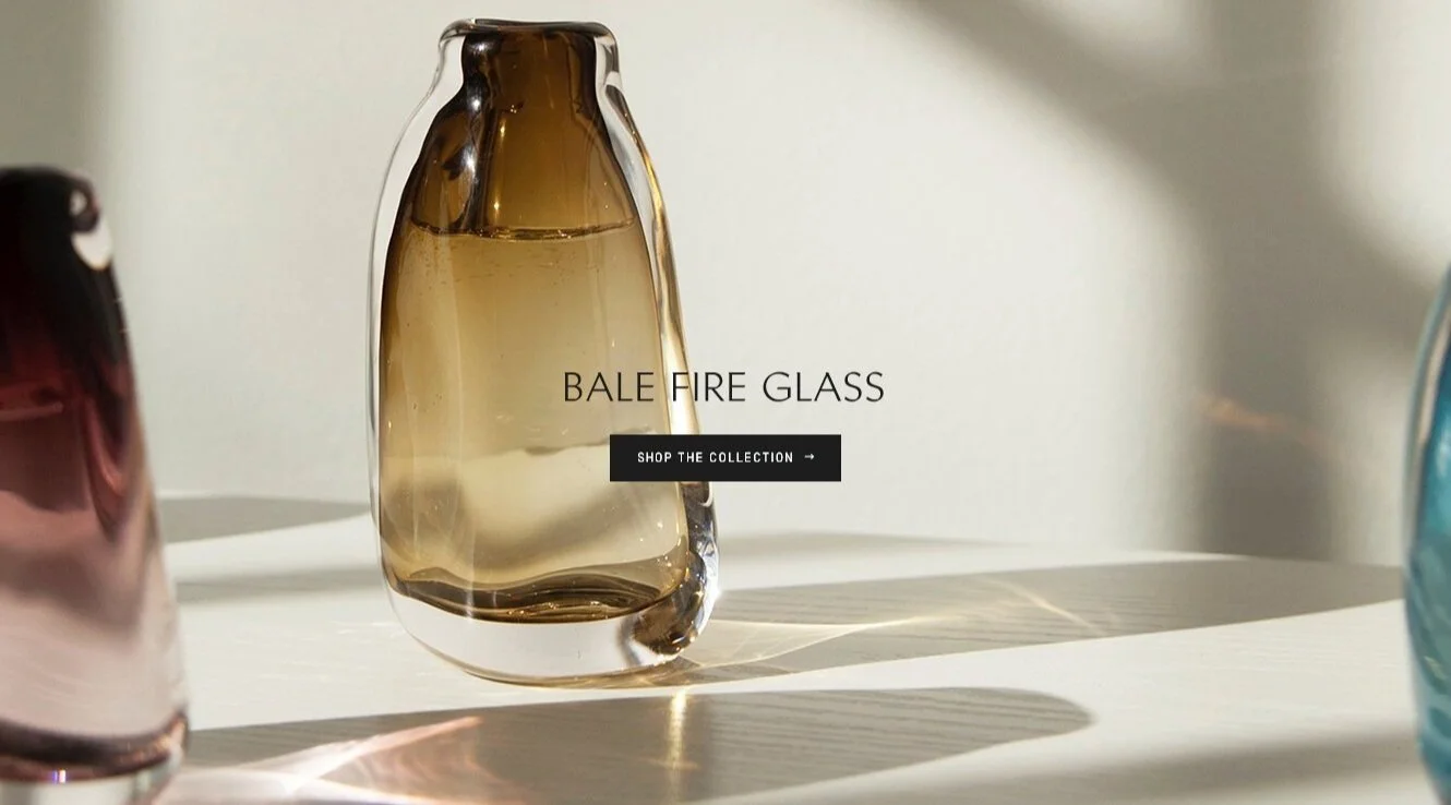
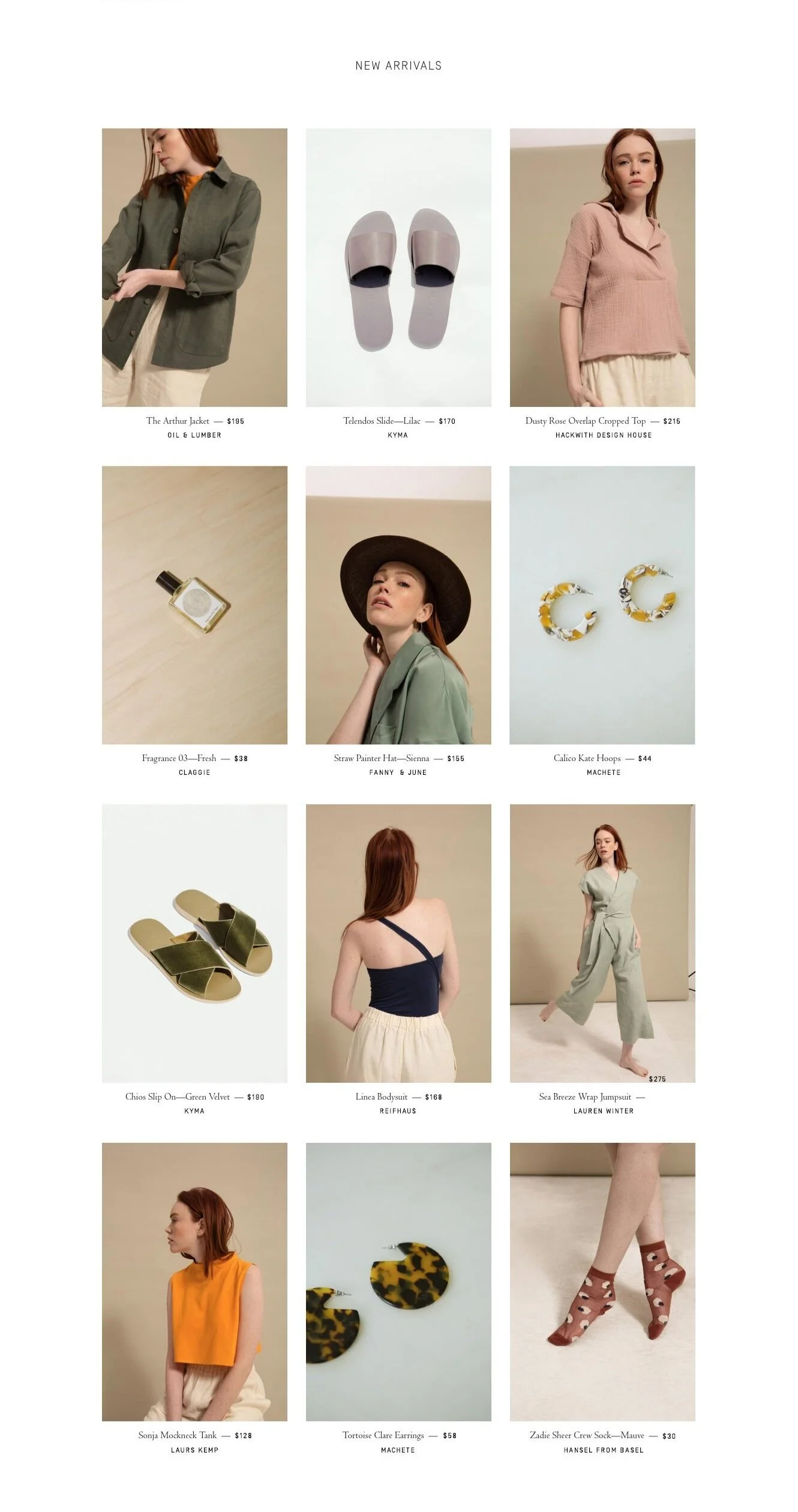
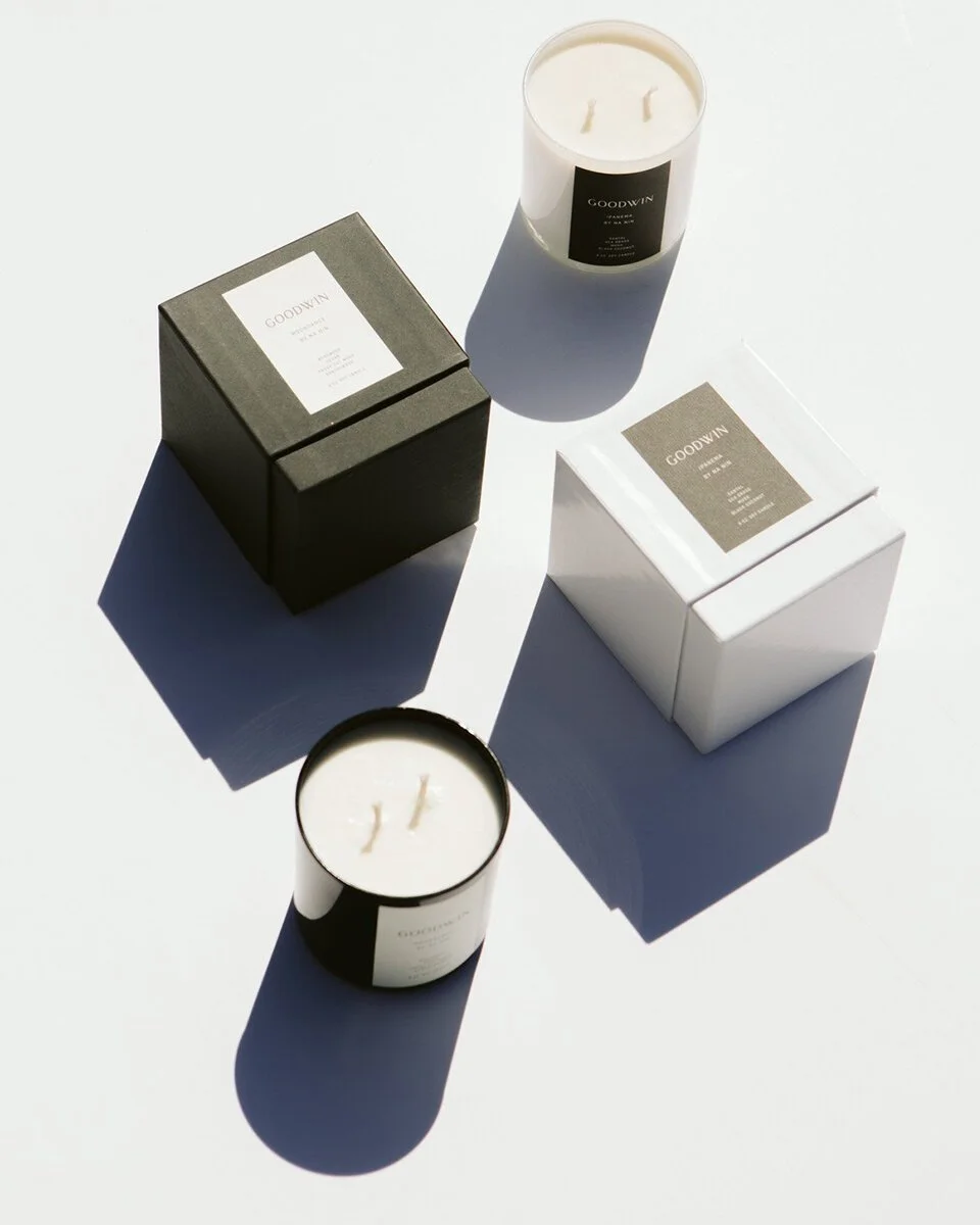
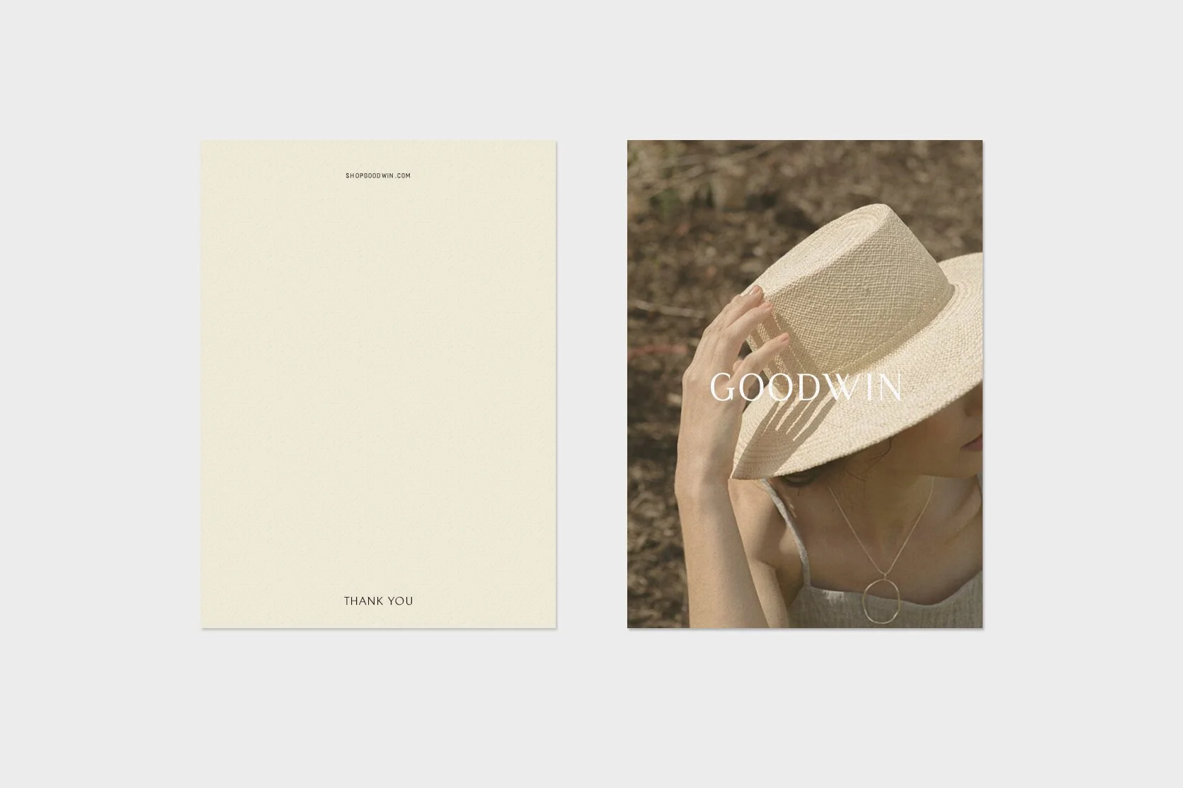
When Nashville native Elise Joseph partnered with us to create the brand for Goodwin, we honed in on the contemporary women’s retail concept. All products in the shop are created exclusively for Goodwin by emerging and established designers in limited quantities. The intention is for a shop founded with meaningful beauty and simplicity in consumption in mind. We developed a sophisticated brand identity, delicate printed materials, and an elevated, clean website.
Services
Brand Identity
Wordmark Logo
Monogram
Printed Materials
Packaging
Web Design
Credits
Interior Photography: Marcus Maddox
Lookbook Photography: Provided by Client
We know budgets can be tight for small brands, so to be mindful of that, we launched the brand with a Shopify coded branding implementation rather than designing & developing a fully custom website. We implemented the brand logo and colors into an off-the-shelf theme, and included custom code to implement the brand fonts. We ensured the website experience would be polished and cohesive with a few more touch-points: coded branding implementation for the Shopify email notifications, a newsletter pop-up app, and a receipt printer app for branded receipts to insert into the e-commerce shipment packages.
We selected brand fonts for a mix of timeless and modern, with details to give it a creative edge.
The primary logo was customized to have serifs in just the right places. The G, D, W, I, N have details that are asymmetrical on an individual level yet cohesive along the top line of the entire word.
The headline font is bold yet delicate. The subtle detail of carved angles legs, arms and bars speaks to the bespoke nature of the products in the shop.
The sub-headers and the body is a beautiful contrast between simple and intricate. The sub-headers are reminiscent of a hand-stamp machine. The body is a classic font used in fine book printing, and echoes the beautiful angles and serif details from the logo and headers.
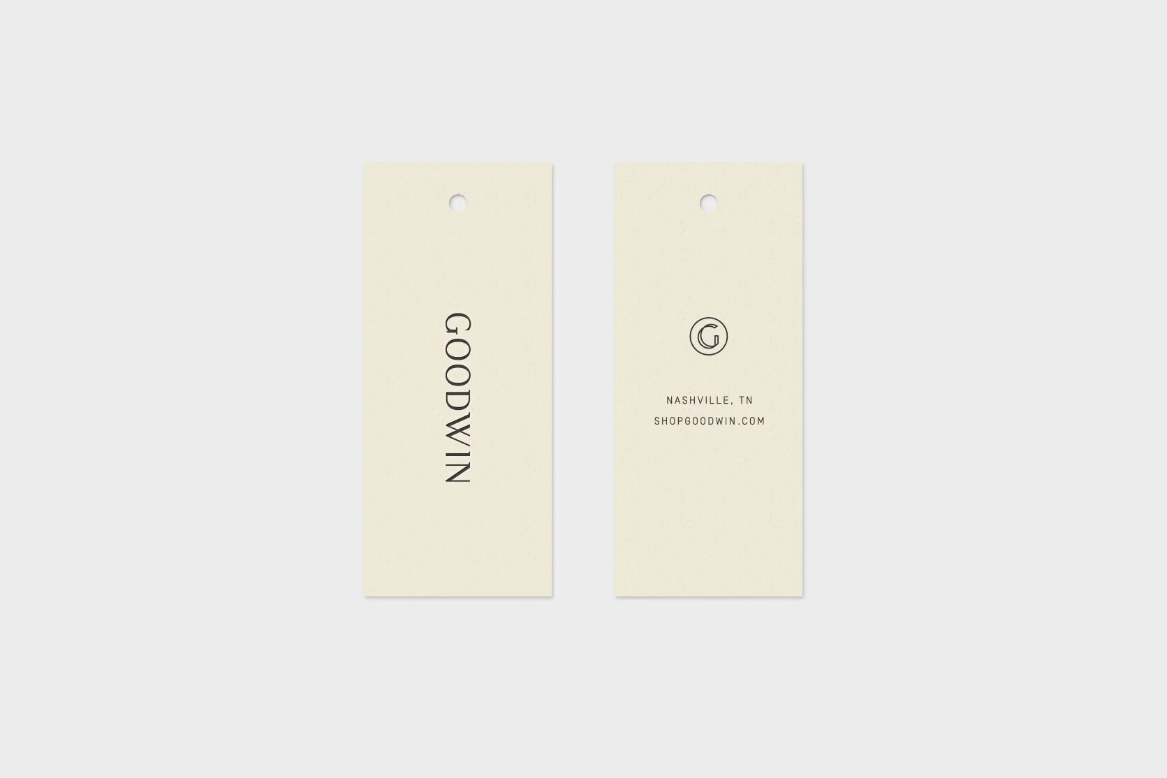
The monogram tells the story of bespoke. When the letter is outlined, we essentially have an opportunity to see it’s form in another light. The angles of the G in the monogram speak to the angles of the serifs through the branding. The line thickness is balanced to the thickness of the headline font.
